● Case Studies
Cogir Senior Living
Brand RefreshCogir Senior Living is a luxury senior living operator offering independent living, assisted living, and memory care communities across North America. As the organization grew and expanded, its visual identity no longer reflected the warmth, quality, or premium experience of its communities.
I led a brand refresh to better align Cogir’s visual language with its audience, its price point, and the lived experience of its residents, while remaining mindful of operational scale and budget realities.
Role: Brand strategy and design lead
Scope: Brand system, visual language, marketing collateral
● Case Studies
At the outset, leadership did not believe a rebrand or refresh was necessary. However, as I spent more time embedded in the role, it became clear that the existing brand was misaligned with both the target audience and the product being offered.
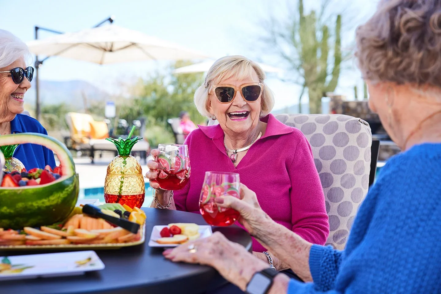
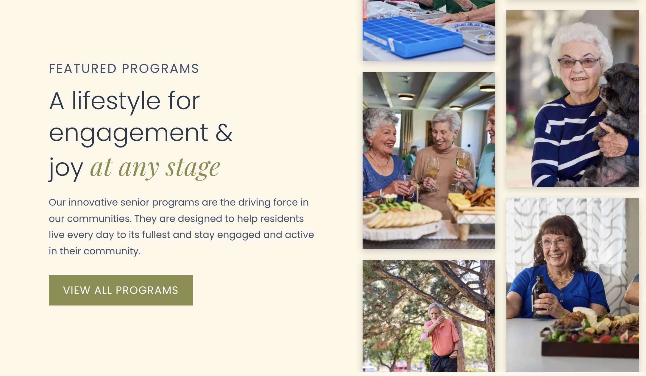
The identity felt cold, overly technical, and visually dated. Senior living is a high-consideration and high-cost decision, yet prospective residents and families were being handed marketing materials that felt rushed, inexpensive, and unpolished. This disconnect undermined trust and failed to reflect the reality of Cogir’s luxury communities.
The Challenge
● Case Studies
With nearly 100 communities, a full rebrand would have required replacing monument signs, wayfinding systems, environmental graphics, and printed materials across every location. This level of investment was not immediately feasible for all communities at once.
The refreshed brand needed to function within these constraints. It had to elevate the brand while allowing new materials to live alongside legacy signage and assets during a phased rollout. The goal was to create a system that felt intentional and cohesive even when older branding was still present.
Constraints and Considerations
● Case Studies
Rather than proposing a full rebrand, I developed a refreshed brand system that remained connected to Cogir’s existing identity while significantly elevating its look and feel. The focus was on evolution rather than replacement.
The Approach
● The Approach
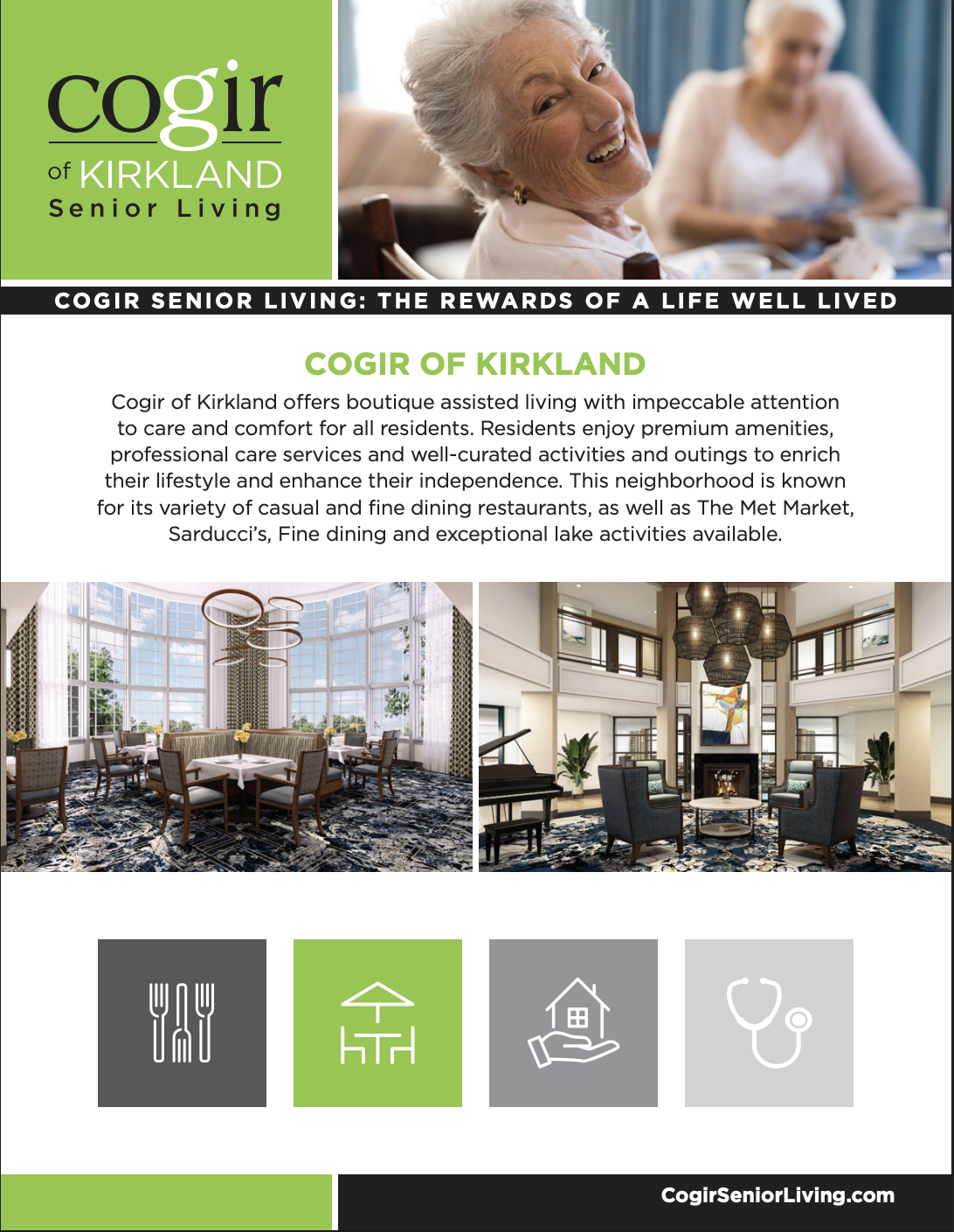
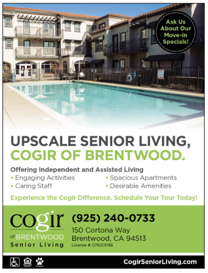
The original palette relied on highly saturated, high-contrast colors, including electric green and black, which felt juvenile and visually jarring. I evolved the palette into a refined and warm system of earthy greens anchored by deep blues. The result felt calmer, more grown-up, and better aligned with a luxury audience, while remaining compatible with existing signage.
Color Palette
● The Approach
Typography
Updated typefaces were introduced to improve legibility across print and digital applications and to bring a more modern, human tone to the brand. The typography supported a premium feel without becoming clinical or cold.

● The Approach
To create a richer and more cohesive system, I introduced supporting brand elements including subtle patterns, warm lifestyle-driven imagery, and flexible graphic components. These elements added depth and consistency across marketing materials and could be implemented incrementally without requiring physical updates.
Visual Language
● Case Studies
A key principle of the refresh was understanding what not to change. Due to the cost and scale of updating signage across nearly 100 communities, the core Cogir logo remained largely intact.
I made a small number of intentional refinements to improve balance and versatility:
The property name was updated from title case to fully uppercase, creating stronger visual alignment and a more balanced lockup across applications.
The logo was simplified to a single-color mark. The previous iteration used multiple colors, with the “G” and the dot of the “i” highlighted in green without a clear functional reason. Simplifying the logo created a more cohesive and premium presence and improved flexibility across print, digital, and environmental uses.
These changes allowed the logo to feel more confident and intentional while preserving brand recognition and compatibility with existing assets.
Logo Refinement
BeforeAfter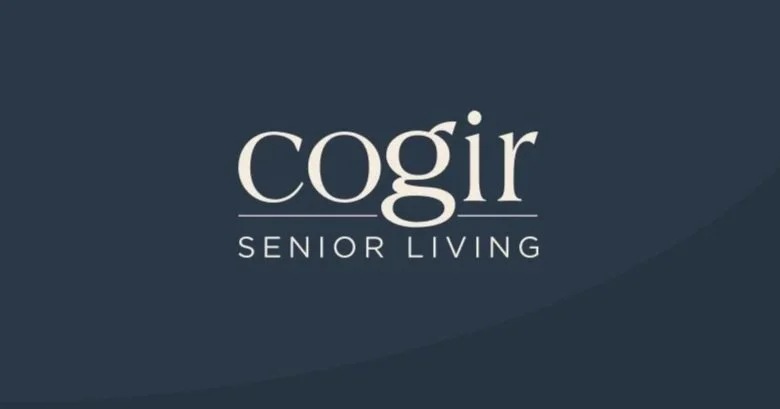
● Case Study
The refreshed brand played a meaningful role in supporting Cogir’s growth during a critical period of expansion.
The updated identity was rolled out during a portfolio-wide leasing push, during which refreshed sales and marketing collateral better reflected the quality and price point of Cogir’s communities. This alignment helped build trust with prospective residents and families, supporting a double-digit increase in occupancy and contributing to record-setting sales growth across multiple regions.
As Cogir continued to scale, the refreshed brand system established a more consistent, trustworthy, and professional presence across the portfolio. This consistency supported the efficient integration of new communities and contributed to the acquisition of more than 50 additional properties.
The Result